Media-Right Layout
This is the media-right layout. Text on the left, image on the right. Two equal columns. The text block sits above a smaller subtext block, while the image fills the right column.
Media-Left Layout
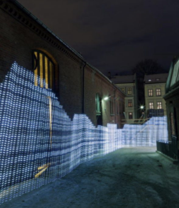
This is the media-left layout. Image on the left, text on the right. The row is visually reversed compared to media-right. The heading above also switches to right-aligned.
Media-Full Layout
Text-Full Layout
This is the text-full layout. A single full-width text block with no media. Useful for longer passages, standalone quotes, or transitional paragraphs that don't need an accompanying image or video.
type: "text-full" — full-width text, no mediaMedia-Top Layout
This is the media-top layout. The media sits on top at full width, with the text block below it. Good for when you want the image to lead and the text to follow as context or explanation.
type: "media-top" — stacked: media above, text belowMedia-Bottom Layout
This is the media-bottom layout. The inverse of media-top: text sits on top at full width, with the media below it. Good for when you want the text to introduce the image or video.
type: "media-bottom" — stacked: text above, media below
Text-Columns Layout
This is the left column of the text-columns layout. Two text blocks sit side by side with no media. Useful for comparing ideas, bilingual text, or placing a quote beside its analysis.
This is the right column. It uses the subtext field to populate the second block. Both columns share the same styling and stack vertically on mobile.